PROJECT CASE STUDY
billyO
The billyO identity was created to capture the craftsmanship and character of traditional barbering while giving it a fresh, contemporary edge. The brief called for a brand that felt confident and stylish, but also warm, welcoming and inclusive, appealing equally to men and women.
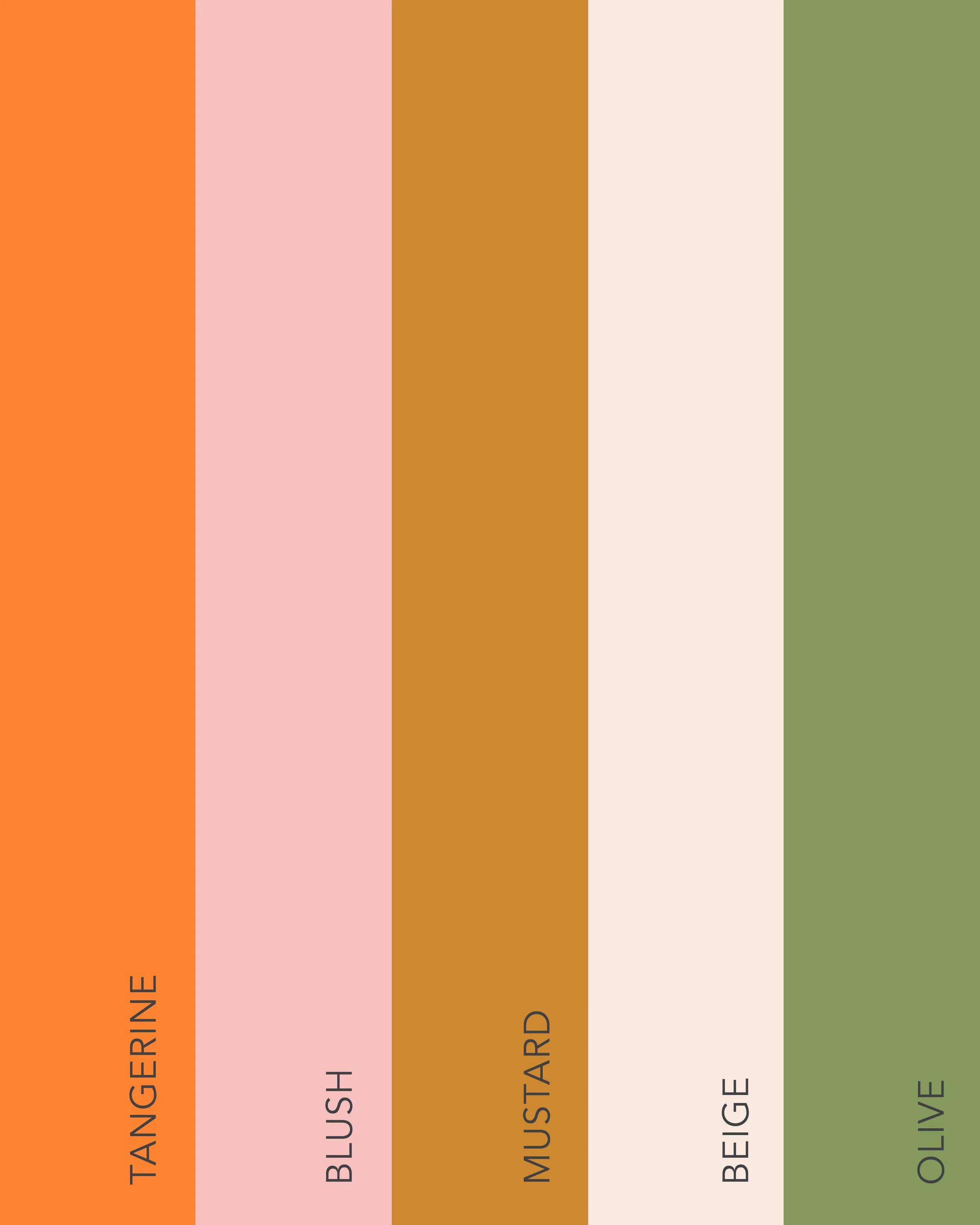
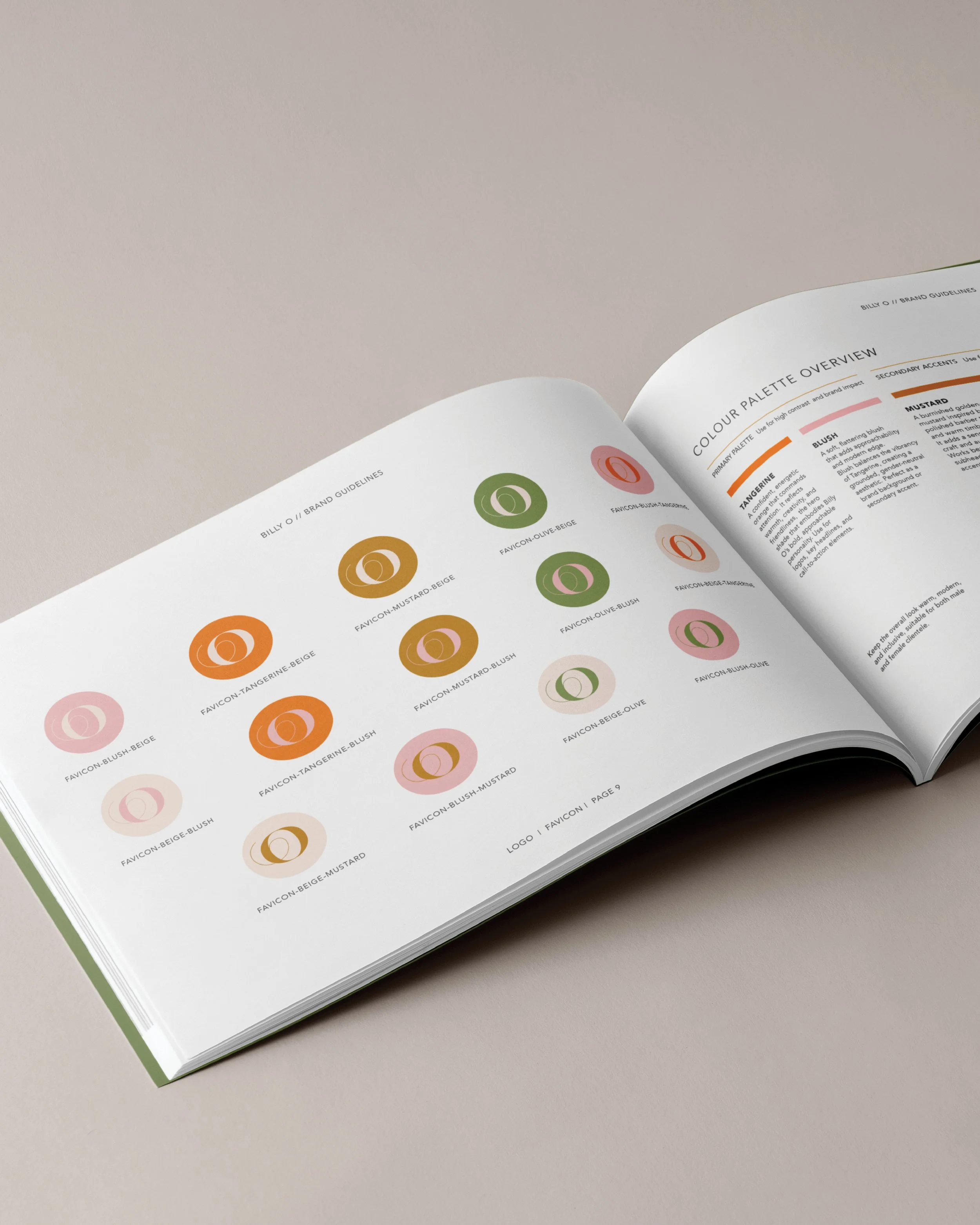
An elegant, character-filled wordmark brings a subtle nod to the past, balanced by clean supporting typography and a warm palette of tangerine, blush, mustard, beige and olive. Together, the elements create a distinctive modern-retro identity that feels full of personality without taking itself too seriously.
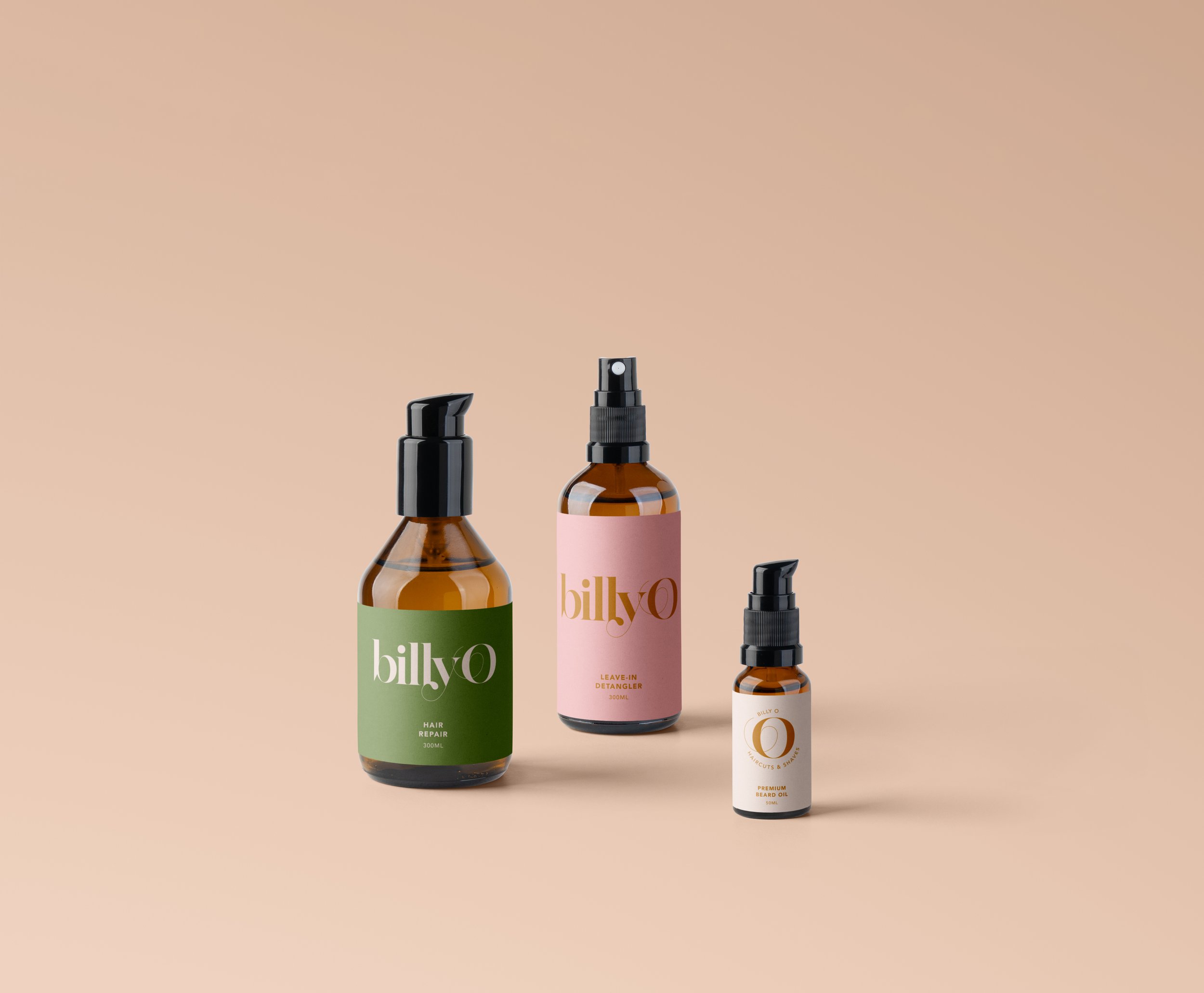
From the primary logo and wordmark to stamps, icons and digital applications, the result is a flexible identity designed to feel unmistakably billyO wherever it shows up.